Pattern Observer is a great source of inspiration. Their e-courses are simply amazing. Last year I learned a lot, taking several of those classes.
Next to the classes there is more. Chelsea's challenges inside the Textile Design Lab takes me almost every time to new corners on a certain subject or motif.
And on the Facebook page Michelle challenges us on regular basis to set steps outside our comfort zone.
So she did last week. The challenge for us was, to pick a color palette you wouldn't choose for your self.
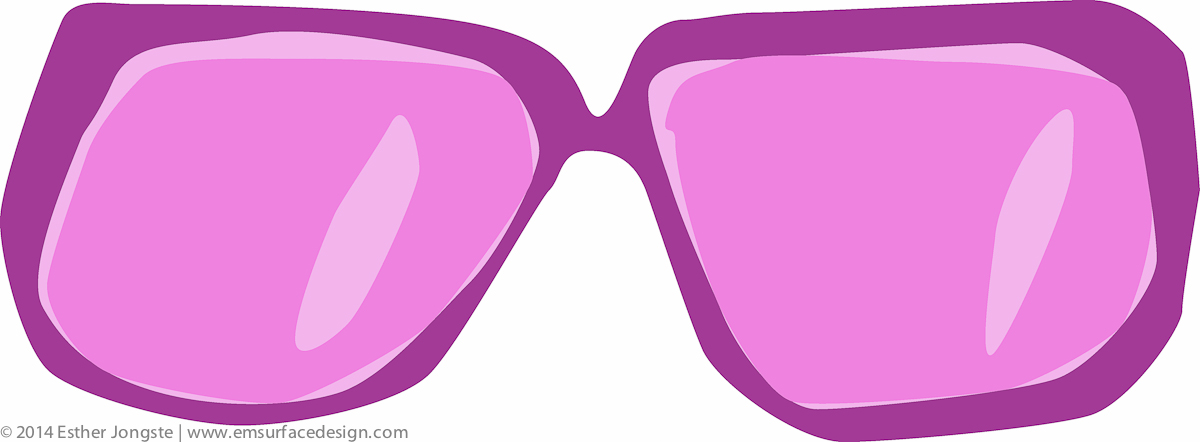
It made me immediately reach to neon color palettes. The fluorescent hues are not my first choice. But what do you think of 'fashion fuchsia', 'thulian pink', 'purple munsell', 'magic mint' and 'carolina blue'? Aren't their names already fascinating?

Most of the time they 'kind of' hurt my eyes.
 This time I decided to ignore that fact. 😉
And it was so much fun to discover I had a good time during several days, designing with these colors I wouldn't choose primary. Thank you, Michelle for these terrific thoughts.
Some pattern play in progress.
 And some sketches as products of my creative time.

Of course I made many more sketches. For sure some of them will find their way to the portfolio, after I have worked out the concepts.
As soon as they are online, I will let you know.
- Which color palette is outside your comfort zone?
- And to which color palette will you reach out first?
Share your thoughts below, I would love to hear from you.
Love your pattern blog, Esther! I think your exploration of going outside your comfort zone is a splendid idea for finding new creative designs. Fluorescent colors are challenging for me, but you made it look so easy! Regarding the question of my go-to colors, I love cheery sunny hues probably because my designs are playful. Maybe I should mix it up a bit and try some dark hues with a playful motif. Looking forward to reading your next post!
Love to hear from you, Chris. 🙂 Great to hear your ‘color story’ 🙂 The neons are challenging for me too. Maybe it is just about: ‘just do it’. I was surprised how much I liked the results. And yes, great idea to combine it with something inside your comfort zone 🙂 And thanks for being so supportive 🙂